Card Design Showcase
Hover-animated cards with dynamic image reveals and smooth rotation transitions.
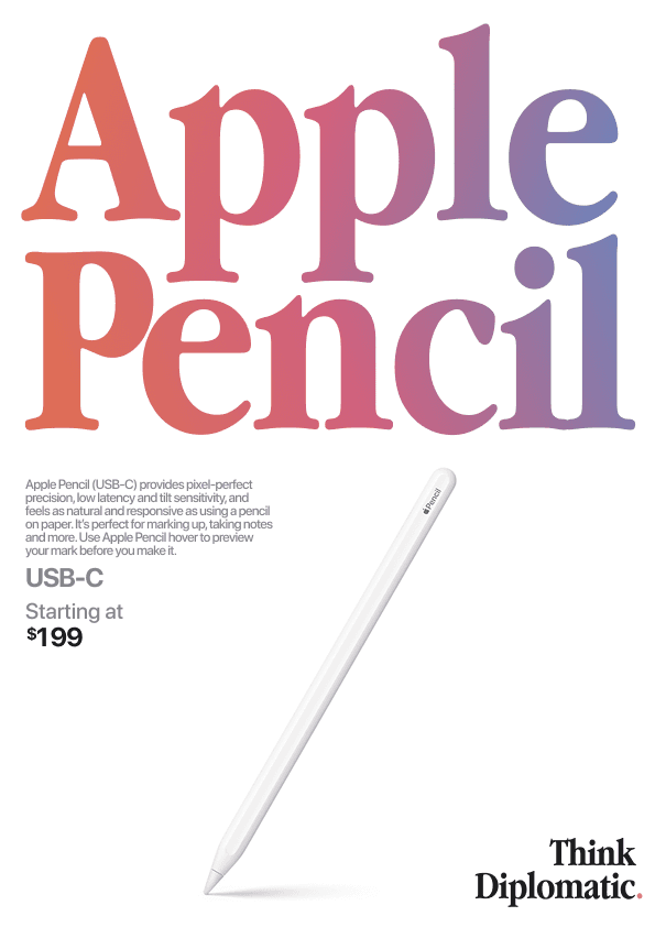

Posters
Usage Code
Create the file first components/InteractiveCard.tsx and put the code below
import Image from 'next/image'

const InteractiveCard = () => {
    return (
        <section className=' flex flex-col justify-end items-center h-72'>
            <div className="flex items-center justify-center -space-x-2 ">
                <div className="w-20 h-fit rounded-md border relative -rotate-4 hover:-rotate-2 transition-all duration-300 bg-white z-9 flex flex-col p-1 items-center justify-between gap-1">
                    <div className="border w-full h-fit rounded-[3px] group">
                        <div className="">
                            <Image
                                id='image1'
                                src='/posterdesignimages2/poster 0.png'
                                className='object-contain absolute inset-0 -translate-y-40 -translate-x-3  rounded-md bg-white rotate-2 flex w-28 h-0 group-hover:opacity-100 group-hover:blur-none blur-md group-hover:h-40 opacity-0 transition-all duration-300 border border-[#82a891]'
                                alt=''
                                width={1920}
                                height={1920}
                                style={{ maxWidth: 'none', maxHeight: 'none' }}
                            />
                        </div>
                        <Image id='image2' src='/posterdesignimages2/poster 0.png' className='object-contain w-full h-full' alt='' width={1920} height={1920} />
                    </div>
                </div>
                <div className="w-20 h-fit rounded-md border relative rotate-4 hover:rotate-2 transition-all duration-300 bg-white flex flex-col p-1 items-center justify-center gap-1">
                    <div className="border w-full h-fit rounded-[3px] group">
                        <div className="">
                            <Image
                                id='image1'
                                src='/posterdesignimages2/poster 19.png'
                                className='object-contain absolute inset-0 -translate-y-40 z-19 -translate-x-3  rounded-md bg-white -rotate-2 flex w-28 h-0 group-hover:opacity-100 group-hover:blur-none blur-md group-hover:h-40 opacity-0 transition-all duration-300 border border-[#82a891]'
                                alt=''
                                width={1920}
                                height={1920}
                                style={{ maxWidth: 'none', maxHeight: 'none' }}
                            />
                        </div>
                        <Image src='/posterdesignimages2/poster 19.png' className='' alt='' width={1920} height={1920} />
                    </div>
                </div>
            </div>
            <p className="text-base tracking-tight capitalize font-semibold mt-3">Posters</p>
        </section>
    )
}

export default InteractiveCard
Features
- Hover reveal effects
- Smooth rotation transitions
- Overlapping card layout
© 2025 Varad Puranik. All rights reserved.
Open to full-time
Open to freelance
Open to full-time